I first heard about Risograph printing from Hannah Waldron,
whose prints I absolutely love. On learning that it’s essentially a cross
between screen and digital printing, I knew I had to try it. Luckily I managed
to sign up for a workshop with Dizzy Ink is a Nottingham based print studio
(they sell out fast!) The studio, established and run by Ben and Craig, two
Nottingham Trent Art School graduates, is situated in Cobden Chambers and has
been immensely successful. They do commercial printing as well as running
workshops, like the ‘Made in a Day’ one I attended. The session was held in
partnership with Illuminate, a council funded Cultural programme based at
Nottingham Castle, and the aim was to create Risograph printed zines inspired
by the touring V&A poster exhibition ‘A World to Win’ currently on at the
castle. The workshop was great fun; I learnt about the
process plus I really enjoyed working on a zine, as I’ve never really done that
before. Here I’m going to talk about the process of Risograph printing, as well
as explain how we made our zines!


It was a beautifully sunny Sunday afternoon, so here are
just some gorgeous shots of Cobden Chambers and of the studio. I really like
this place, it's a great creative edition to Nottingham!

Examples of Riso Prints

The Riso machine drum (yellow)
The Process
The Risograph machine is similar to photocopier, but into
which you can scan a design, like making a screen, and then print multiples of
that image. You change the colours of the drum (or drums, they had a machine
with two as well as with one) depending what you want to use. The machine burns
your design onto special paper which is wrapped around the cylindrical drum
(all this is done inside the machine, and it tears it off once finished too –
nifty). So once this master copy is made, which is the expensive bit, then its super
quick and easy to print off multiple copies, like a digital print. But you then
can do different layers with other prints and colours, so it’s still quite a
hands on process, like a screen print. Apparently, as it uses soy ink, it’s
pretty environmentally friendly (unlike screen printing), and it’s relatively
cheap (unlike digital printing). I really like the aesthetic of the print, and
I feel there is a lot you can do with it, here are some examples.


Colour
As you buy special inks, the colour palette is a bit
limited, though you can choose different tones within the selection so there
does seem to be quite a lot of choice. Though the colours aren’t similar to
what I’d use in screen printing, I think they really suit this process, and
make amazing effects. The ink prints translucent, so you can make colours by
overlaying two different inks. For example you can make orange by overlaying
pink and yellow.

Beak Book Zine

Task 1: Beak Book Fold Zine
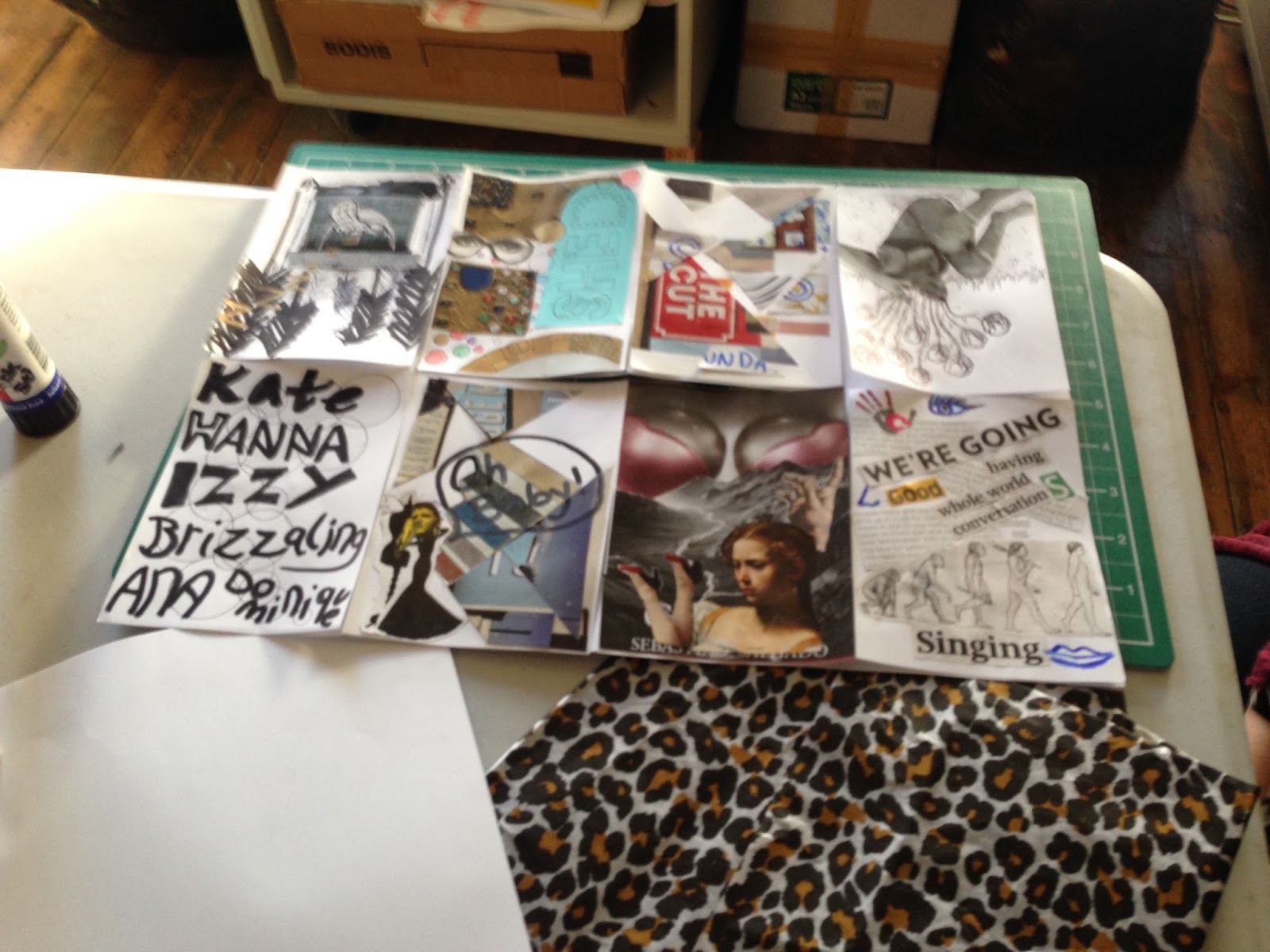
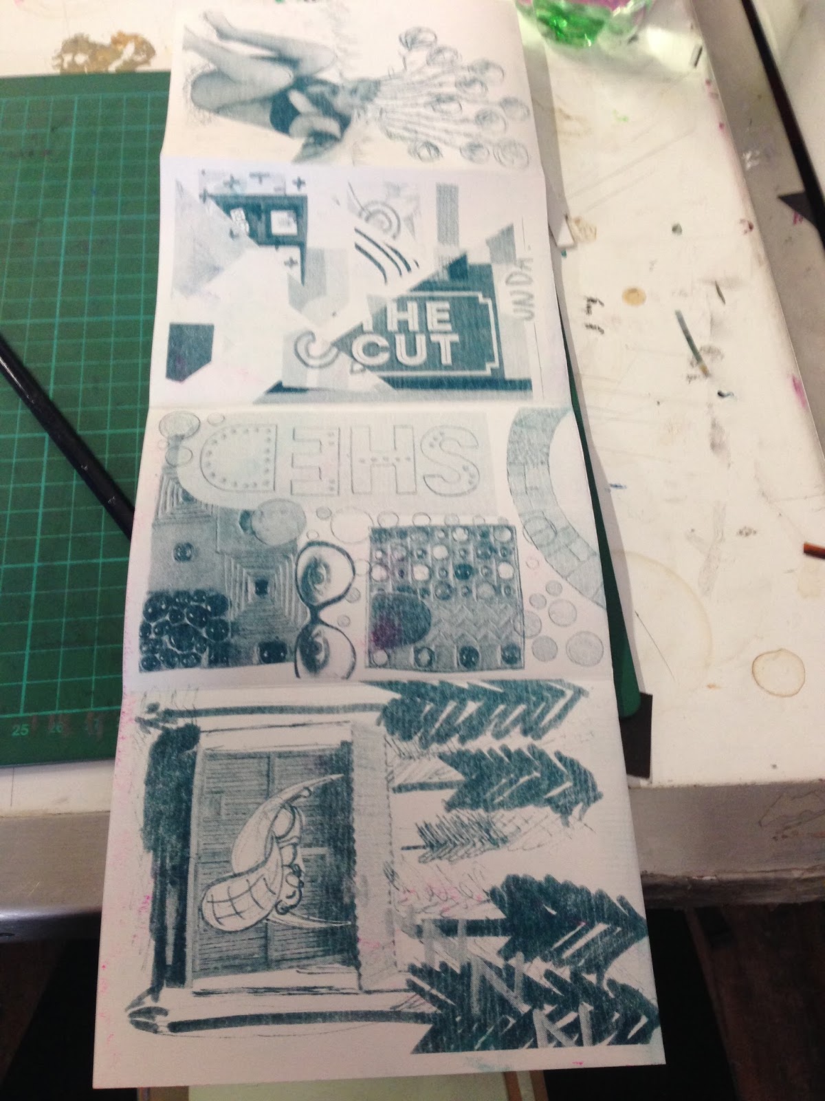
As our ‘starter’ exercise, in groups of six we were asked to
make an A6 image each which would be printed single tone onto a single A3
sheet, with which we would create beak book fold zine (the reason for the name
becomes clear when you fold it up). We were to collaborate on an A6 front and
back cover (making up the 8 pages), and again on the A3 poster which would be printed
in two tone on the reverse side of all our individual designs. We were free to
make any image we liked, so I made a cut up collage full of triangles and all
good things. We then had to decide on an order for our pages, ‘the edit’, which
was good practise to the later task. It was also good to think about what
effects one could achieve in one tone, and then again in two. The photo here
shows how we had to arrange our pages on the A3 sheet so they would look right.
To fold the zine, one should use a bone knife, though the
edge of a pen or scalpel will do (the ink is always a bit wet so you can smudge
it with your fingers).
Step One: you fold it length-ways, with the individual pages
on the outside

Step two: you undo that fold, and then do the same
width-ways, again with the pages on the outside.

Step three: you keep that fold in place, then fold to two
outside columns in to meet the middle fold

Step four: you unfold the whole thing, and poster side up
(using the fold to get your ruler in place), you use a scalpel to cut a
straight line through the long centre fold (the first one you did). It is
important to only cut between the middle two sets of individual pages, cutting
an extra cm up and down from the widthways folds (see diagram).

Step five: to fold the zine, you fold it back up along this
long zine, and then make a ‘beak’ with it (possible now due to the incision).
You then find your front cover and back cover and fold the pages accordingly.
And voila! You have an 8 page zine with a foldout poster, how good.
We were shown a selection of other zines made from an A3
piece of paper (the standard size I gather), but folded in different ways. They
used different ways of opening, some featured pop outs, and they came in
different shapes and sizes. As long as you can fold it from an A3 sheet, then
you can make a print to suit this. This really inspired me as it plays between
2D and 3D, so it’s a process I want to play with for a bit without the Riso
print. Basically it is definitely worth playing with a piece of A3 paper and
seeing what you can make!

Task 2: Collaborative Zine

The emphasis on this task was far more in the content than
in the process of making, although it was great to have a go making something A4
and in two tone. The brief was essentially to take a news story which we feel
is skewed by the media, and communicate it in a way which we feel is true and
honest. In the essence of statement-making, protest and rebellion, as the
‘World to Win’ exhibition focused upon. We were given newspapers to make
collages from. I couldn’t quite pick one story, though I wanted to hit out
against the idea that ‘ignorance is bliss’ in terms of the news, and again use
my ‘geometric patchwork’ aesthetic and process. I predominately used my two
different tones to represent the two different approaches, as well as some hard
hitting words to get the idea across. Here is my outcome, plus some of my other
favourites.

Mine is on the left!


The final design decision came in the form of having to
‘edit’ i.e. choose the order of the pages. Then Craig and Ben did the pretty
technical process of working out how all the pages would be printed (four
people’s designs to one piece of A3), and the best colour saturation to use.
They also printed us a cool tracing paper cover. We helped fold and collate the
zines, then they stapled and trimmed them (we were sure to leave a margin
around our work). And voila! Again, a pretty quick and effective way to make a
really professional looking hand-printed zine. Though I feel I’m more
interested personally in making prints then zine (you really have to make
multiples to make it worth it), it’s great to be able to take one home, all
made in a day.

The Edit Process
What’s next?
Throughout the workshop we were all chatting with Ben and
Craig, two seriously chilled cool down-to-earth guys, it was really interesting
to hear about the business and what’s in store for Dizzy Ink. They’ve got a website up and coming (so check
it out for new events), plus they’re launching a Kickstarter campaign to grow
their studio in the hope to make it open access. They’re also working with
Raw-Print on a zine (which we got a cheeky sneak peak of), and planning on
doing some ‘Riso Pro’ workshops – using computers to make really amazing
layered prints. And what’s next for me? Hopefully another playful session with
these guys, where I can experiment further, and then eventually-hopefully
making a run of prints to sell! I see a lot of potential in the process, and
things I could combine it with like collage. It was also really interesting to
learn about Illuminate from Rosny (the organiser), so I look forward to seeing
what they get up to next.

Riso Pro Workshop Booklet
So cheers to Illuminate (whose funding made the whole thing free!),
and to the guys at Dizzy Ink for all the useful tips and info. And especially
thanks to however invented the Risograph print, I think I’m in love…
No comments:
Post a Comment