Monday, 4 January 2016

Fabric of India - V&A

I knew I was going to be writing notes and thoughts of inspiration all through 'Fabric of India'. Partly as it is another of the V&A museum's annoying 'no sketching' exhibitions, but mostly due to mounting sense of hesitation and a lack of confidence in my drawing ability to do Indian texiles any justice.

Please note: excuse the poor illustrations, I took photos of the exhibition catalogue book. 

The rich history and culture of India and its textiles, particularly in light of its influence on and relationship with Britain is enough to write a million blogposts about. Descriptive language heavily (particularly when photography is not allowed). My summative view of the artefacts and information curated and presented focuses on narratives presented through imagery, timely craftmanship presented by process, and a general appreciation for the varied functions, techniques and colours which make Indian textiles so unique. 

To start loosely chronological. Imagine, upon entry, walking in and immediately casting your eyes onto a vast wall hanging upon entry, perhaps 20 by 10 metres. Woven with large rich red and green flowers upon cream with similar motif borders. A relatively simple design, apart from it's complex scale. You go up to read the display card, informing you that it is a floor spread, a "summer carpet", making an indoor garden for those sitting on the floor. Immediately the culture difference is apparent; there are different design needs and considerations. And one sees their first glimpse of how important and everywhere textiles, decoration and adornment are within India, as 'Flower patterns were used widely, from manuscript borders to architecture.' 


A somewhat more subtle form of decoration, for which I have a particular fondness, especially as the V&A, is the exhibition design. The most evident and coherent example was used to write out the titles of the information boards. The words are pieced together by letters formed from sewing machine-stab-style dots, like unpicked stitches, with thin perfectly straight taught 'loose' threads inter-connecting the letters. Above the vast summer carpet by the entrance, the title 'Fabric of India' is spelled out by round light-bulbs instead of holes. The pink-red yarns emitted are stretched horizontally high high up to make a glamorous temporary delicate ceiling). A lack of colour of the information boards takes reference to fabric stripped back to their basics: nothing need to be done to make reference to the vivid colours and embellishments which cascade into peoples's heads upon the thought of Indian textiles. 


The layout of the first room, essentially an introduction to the world of all things textiles as well as Indian specific, is curated by process. Natural dye substances, tie-dye techniques, raw fibres, embellishment, print, weaving and embroidery are covered. I particularly enjoyed the print section, in light of my own work using modern processes, and also for my interest in wood carving, such as that used to make printing blocks. The process of crafting these was illustrated by a video, showing how they trace the pattern by transferring ink from tracing paper, using a grid to match up the motifs. Then small nail like chisels are used to cut away the wood. It was mesmerising to watch 


The accompanying information board explained; 'In India print is associated with the north and west. Dress fabrics used small repeating floral patterns in several colours, requiring multiple blocks. From about the 14th century, western India used large blocks to produce huge wall hangings.' One dress fabric on display, named 'Galamkar', decorated with seemingly whimsical scenes of animal, people, trees and palaces, presented the lengthy process these textiles went through. The display describes it as 'cotton hand-painted, block printed with mordants and resists, then dyed'. This can only go to demonstrate how print, along with dye and weave, were rarely used alone, yet combined demonstrating a level of skill and passage of time, an element integral to the appreciation of craft and hand processes. This narrative-rich artefact reveals to us a 500 year old story; a timeless piece of physical beauty. 


In addition to print, I greatly enjoyed the embroidery and stitch section. One piece which stood out to me was the Kantha embroidery of west Bengal and Bangladesh. It was a square piece of plain pale cloth. embroidered in a simple running stitch, using red and blue threads. It seemed quite unusual colour wise and it's simplicity, yet this accentuated the simple yet intricately detailed linear quality. It resembled a line drawing with characters and scenes of a story. This kind of quilting was uses to to make bed spreads and sitting mats.


Of all the elements of the exhibition I find difficult to capture with words, it is hard to describe the richness of shades and hues. There were so many gorgeous colours (and once gorgeous but now faded ones on display). One which will stick with me however is gold. The gold leaf printed textiles so luxurious, embellished and woven threads of an exquisite and delicate beauty.
 

There are several items I wish to directly focus on, for their combination of narratives, functionality and evidence of process. The first is the Bhitiya, a style of wall hanging used to decorate interiors for events such as weddings. The one display entirely covered the walls of the small separate room it was in, accompanied by the sound of traditional Indian joyous music, I felt immediately transported far away just being there. Like a vast patchwork in red cream greens with slight bursts of purple and yellow. It's embroidered stitches and appliqué grants it a 2-dimensional tactile quality. Graphic patterns dance alongside illustrations of men and realistic animals such as elephants, and more ambiguous ones resembling cow-horse hybrids. 


I just love the idea of textile, pattern and colour being used to adorn every surface, particularly within architecture. A stunning and frequent demonstration of this came through the inclusion of 'tent lining textiles', the most notable being Tipu sultan's tent. Rulers all over india used tents as moveable palaces, during pleasure trips and hunts as well as on military campaigns. Their outsides were plain but insides highly decorated. I have a developed interest in adaptable and flexible (as in transportable) architecture. So this spatial decorative function, which applies narratives to physical space, really made my heart sing. 

Another item that I was immediately drawn to was the Map Shawl. Not actually designed to be worn, it looked heavy, being so full of intricate detail. It depicts the city of Srinagar in Kashmir, with reference to real life features such as the lakes and the mosque. It's playful and illustrative; large expanses of water break up a pattern of houses, all blending into a similar pattern but look closer and they are different. It's so intricate it's almost hard to focus on, not helped by the amazing colour fringing along the ends. Though saying that there are so many different elements to it people will focus in on different things, see the story they want to see. Maps are made to be looked at close, they are things to be explored. 


The final item I will focus on is the 'Flag', depicting the death of a muslim warrior. This was immediately striking as the only a-symmetric wall hanging in the room. There was long, short, wide, narrow...; there are not many words which could aptly describe the shape of this, other than jaunty. At 6.8 metres long it was fairly large with it's far edge formed of bunting with pom pom tops like comically oversized fringing. It's body was embellished with pictures from the story, though from looking it's not clear to me whether it is in an kind of chronological order, or facing an particular direction. Despite all these I think it is very fun and attractive. I like things being kept open to interpretation.


The final rooms of the exhibition dealt with trade and changes in industry, still imposing an overwhelming appreciation for the unique and exotic nature of indian textiles which still remains today. Though saying that, it's still evident that the shining light of craftmanship is falling away into the dark shadow of fast and throwaway fashion. Still, haute couture can try help balance the battle. I loved the Isabel Marant dress from 2012 embroidered at Les Ateliers 2M, Mumbai. A jaunty patchwork of intricately embellished indian fabric, cut into a small cute yet sexy dress. Manish Arora's ode to traditional indian textiles, ever on-trend street style and contemporary saris close the exhibition, yet as ever by good curation they present the start of the next chapter 


Overall I greatly enjoyed this exhibition, I found lots of personal inspiration in it, though I feel that is a power traditional textiles always have over me. I feel like now with modern technologies there is a drastic change, not only in textile production but in the way we need, use and feel about them. As designers I think it is important to look back at these examples within a contemporary context, so we can see how we can add value to our own work in a world which is so different, and ever-changing. A value which engages, inspires and is appreciated, ensuring longevity. I can safely say I feel the pieces of cloth I saw today tell stories of a very long and happy life, not only within their decoration, but within their very fibre. 


Monday, 21 December 2015

Khan Academy - something I stumbled across

As I was just causally scrolling through the Tate website, I stumbled across a link leading to their 'free online courses'. It led me to this:


As a well versed online procrastinator, I love free online educational things to make my time-wasting seem more productive. The short and sweet format of these Khan Academy courses appeal to me greatly. Though I am not familiar with this site, they feature a range of courses in many different subjects such as Maths, Art, Science and Computing. 


The site also shows that it is partnered up with many Museums and galleries from across the world, and best yet it appears to be entirely free though asks for donations, and provides the option to log in and track progress. 


I was particulary taken by the MoMA printmaking section, though I am excited as there is still much more to explore!  

Find it at the www.khanacademy.org and start learning now!

Tuesday, 1 December 2015

Organic vs Manufactured - Geometric Patchwork Prints

Here is me just learning what I like and don't like through comparison. See these two examples of a similar 'collage-effect' geometric patchwork prints

Graphic Triangles 16 x 20 art print by shopampersand on Etsy

Kitty McCall Print

I much prefer the second one to the first, maybe it's partly to do with the colours, but I like the slightly disordered natural looseness of it more than the rigid precision of the top, The colours in both are still very full and bright. There are slight additions of white, and not much texture used other than of stripes, I suppose they would be too busy with more 

However; this throws a spanner into the works
Kitty McCall Print - Ankara

Again, I love the colours, however the lines and shapes are far more precise than the other McCall print I like. The shapes' refined nature now mimics the first print which I didn't like so much, and now I think this is my favourite! How confusing. However, it is easy to see that the McCall prints are completely a-symmetrical, presenting unexpected compositions. I believe this is what I connect with in a print design; these could be abstract drawings of real places or things, whether the first is clearly just a pattern. I should keep exploring A-symmetry in my print and construction work, as well as continuing to push colour balanced with white and carefully considering where to apply texture. 

I believe these prints are digitally designed, which would be easy for me to play with! Also collage would continue to work equally well. Painting would most likely give me a slightly more organic edge, but this would be nice in the medium. With print, patchwork, digital, drawing and painting to play with, I'm feeling very excited! 


Sunday, 29 November 2015

Shapes and Lines (from drawing to 3D product)

I love the aesthetic of block shapes (2D) with linear ("1D") structures. See the book shelf below


As well as loving the curation of objects and space I, feel this aesthetic really relates to my drawing. Below features textures (dot patterns) to piece together 2D forms to have spatial prominence. 


Modularity is also integral to what I wish to achieve, the image below shows an example of a slotting system, to achiebe a similar function 


Extremely pleasing geometry there! And ordered space! 


Wednesday, 25 November 2015

Fusion Event - 'Enhance your opportunites'

Today I attended an afternoon event organised by my university's employability team. It consisted of a series of talks focused on careers and entrepreneurship within the creative industry, as the full timetable illustrates below. I wanted to attend as I enjoy looking at job adverts and thinking about I will do when I graduate. Though I do hope opportunities will come my way, I know I will need to present myself and my work in an effective way, and make sure I am in the right place at the right time!


Timetable for the day. 

The Keynote Speech

This pre-recorded interview with Wayne Hemingway, of Hemingway Design, was presented to us via youtube. Though a real presentation would have been good, in some ways a video that I can re-watch and was edited in an effective way. I feel I really benefited from learning about his interdisciplinary approach to design, which generated from a fashion label (Red or Dead) with a real purpose (to be the first affordable fashion label.) Rather than focusing on education, Hemingway highlighted that good designers should be interested and curious in everything they come across, with some real true passions (even obsessions) in key areas. This inspired me to get more involved in my blogging - even if short and sweet - because it is an effective medium to document and piece together all the random things that inspire me, I experience, or even that I unexpectedly notice from day to day! 

Furthermore, Hemingway really encourages the designer to have fun, and be playful, and let this come across. Sustaining healthy working relationships and building networks is key to success, especially once leaving university, where there will not be tutors or studio peers to turn to each week. In terms of discussing work, he suggests to be questioning of own work, and ask others to question it to push you, rather than letting it be 'fawned' over. This (and hearing Katie speak in the next segment) really makes me value the importance of being yourself (a.k.a. a nice genuine person hopefully!), being friendly to everyone and being happy by having fun with what you do! 

There were many other valid points raised in this segment, proving the benefit of having a potential future employer give a talk relating to what he would look for in up-and-coming designers, as well as talking about his own journey and sharing with us tips that he picked up along the way!


Your Personal Brand

Katie Alderson is the founder of Ideology Workshop, and a graduate of my course; Decorative Arts at Nottingham Trent. I am interested in branding, and though I am not doing the business project I feel inspired to create a brand for this year. I would worry about doing this and my work losing it's 'personal touch', however Katie showed us how to balance a super precise and elegant brand with a human element by using a website and social media in slightly different ways. I know when I leave I would be interested in working for a brand, thus showing this awareness in my portfolio would be a benefit. She also reinforced the point that good photography is key in your final year, as a picture can speak a 1000 words, is more eye-catching and is easier for creative minds to process. 

Again, a lot more amazingly relevant and useful content was discussed, I love following Katie's process and recommend everyone checks her work out!

Linked In

This session, for someone who thinks they knew Linked In, was ridiculously useful. All the useful in-depth how to's, must do's, and must not do's, has given me oodles of confidence to use it as a networking tool. I am not sure how relevant it will be for future employers to check me out on (it would be nice if they did though!) However again the focus on networking and presenting an engaged, ambitious and positive outlook could help develop personal and professional relationships, as well as stay up-to-date with industry information, from knowing what companies I could work for to even just knowing what type of jobs are out there (always good for an interview - or even speculatively asking for one!)

The Opportunist

This section was similar to the compulsory employability sessions we've been doing during our degree, though I still feel like each one I learn something new (though maybe I'm simply relearning...) I felt a real focus on transferable skills, as well as how to actually apply to jobs. From my meeting with the team a few weeks ago, I felt inspired to update my CV, and focus more on skills gained. This session gave me even more ideas of what to include, examples of evidence to support my claims, and how I want to sell myself.

One exercise I feel I particularly benefited from was taking a minute to discuss our weaknesses. One example that came forward was someone admitting they talk to much (a bad habit of which I am guilty of!) They followed up by saying how they were trying to over-come it, by doing more active listening, and trying to take notes whilst people talk, and really thinking about what they are going to say. I definitely will take this on board (another thing that evaluative writing/ blogging might help me with!)

Overall conclusions

So, as well as being really useful to all the things pre-outlined on the timetable, I really enjoyed this session as I feel it satisfied in some way my procrastinate-ive habit of thinking about the future. Better things I could do with my time include updating my CV and my Linked In profile, blogging to show my many interests and research, and use this to build my personal brand. There is no point looking for premature opportunities if I have not got anything to show them to prove I know what I am talking about (which I should do less of to start with...)  

Sunday, 4 October 2015

Communication inspiration - Collezioni Trends

I love reading magazines. I mean who doesn't!? But I feel the large glossy tactile medium is particularly suited for design. From the beautiful art direction, stunning photography, intriguing articles, to the effortlessly cool design and layout. I feel inspired to make my own sketchbook/ journal to help communicate my interests and concepts. I'd be interested in seeing how all the different interests that focus on fit together in the ever-boggling jigsaw puzzle which is my creative direction. Let's hope I can keep this ambition up, as I feel always much more proud over something physical I can show or tell than a blog link (sorry I still love you too!) 


I particularly liked this article featured in Collezioni trends (all rights reserved to them!) The first page introducted the titles of the rest of the segments in the form of a poem, and used little symbols to link them up. I love seeing the connection between images, words and a deeper concept, such as a factual meaning and further article for each line of the poem. 


Nothing beats a bit of creative Sunday morning inspiration! 


Friday, 2 October 2015

Miss CHU - Melbourne Restaurant Review

Single and ready to ming-... Eat my way through Melbourne. I'm living the counter life for a few days, and where better to start than misschu, where I can watch the fire rise from the kitchen in front of me


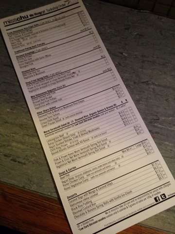
I do love a tick sheet ordering system (there's not enough of them in the UK for the novelty to have warn off yet. I ordered the tiger prawn green mango rolls, a bbq pork bun and the special sesame tuna tartare. Then a lychee and cucumber frozen young coconut crush to wash it all down. 


Only problem with watching the kitchen is that you can see them make good things that you haven't ordered... Like the sauted shitake enoki and shimeji mushrooms, I might need to start rethinking my opinion on fried mushrooms.


The Vietnamese rolls were good, standardly delish and fresh, plus super generous size! The Bun was super fluffy and the filling moorish. Steamed buns are one of my favourite things ever! 

All food super fresh and simple, the kind of place which wouldn't overkill, under flavour or make greasy spring rolls (which I avoided to order in case.)  


The Tuna tartare was a bit of a random choice - I dont eat raw fish all that often, I love raw red meat (as much as you can 'love' something so rich that a small plateful is often enough.) The fresh lime squeeze added a nice touch. It has an odd texture, a bit like a ripe tomato flesh; quite light and springy with a gelatinous shine. 

The light fishy taste went surprisingly nicely with my coconut smoothie which finally arrived. Like a wacky asian answer to a big mac and vanilla milkshake. Beautifully sweet and refreshing, it was the perfect thing to calm my shirachi overkill spiced mouth! Could easily wake up to one of these everyday, though I dread to think of the sugar content 


With my food mountain nearly conquered,  I looked around to weigh up my choices. The rice/noodle salad bowls did look really good, I had avoided ordering as I meant to order small because I wanted a big brekkie! I think one of those would have been a more sensible spend of money than the tuna tartare. But then it would have filled me up so much I wouldnt have a chance to sample. Good to know I could have gotten dinner for about $20. I may have to come back nearer the end of my time here when I'm not feeling so flush

The kitchen closed at 9, boo melbourne is such an early city. It probably didn't help that I landed on a Monday I preorderd a custard bun for dessert. I think I'll make breakfast more like brunch tomorrow... Plus an early start! 


Another thing which dawned me too late is that there is probably a good reason why tuna tartare is a share dish, it is super rich! Still, rather that than the pho. 

The custard bun is not a particularly attractive thing to photograph. And as I bit in, I realised that it was very similar to a doughnut, a baked good that I was trying to avoid now after Brisbane. (Cronuts, cruffins,... Now I see what all the fuss is about!) 
I'm not sure about the texture of the shiny bun. Relived to find the custard centre on my second bite. Oh gawd, so good! Super vanillary and eggy. Goody! 


Note on eating by yourself in restaurants; I can't tell if it's better or worse to be alone when you drop food on yourself. I'm feeling the latter, like I'm too inadequate a human to get food into my mouth let alone go on a date. At least I can blame it this time on the chopsticks. 

I'm not risking it on the custard bun; handled and eaten like a donut.

Price: $32, so £16. final words: 

Well, that will keep me going till brunch!